The problem
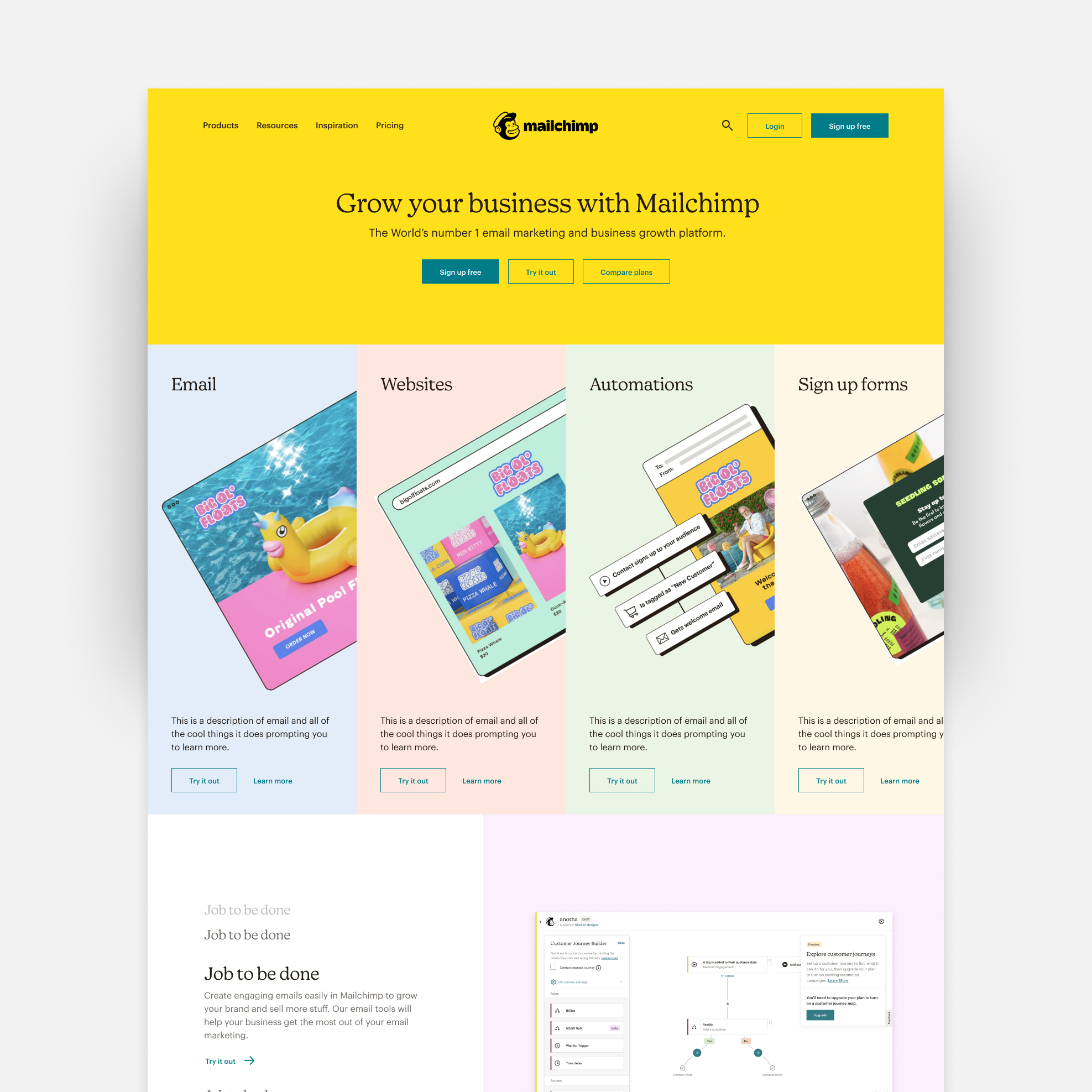
By 2022, two problems were quietly hurting Mailchimp's homepage.
- It became the place to mention every project we launched: over 15,000 pixels long, 30+ features with no hierarchy, and users rarely scrolled past the first 2,000 pixels. They were overwhelmed and ignored most of it.
Every signal, user interviews, CSAT surveys, and stakeholders, suggested we had to add more information to the home page. But my instinct and common sense told my team that less is more. - The pastel colors, illustration-heavy "easy to use" brand was built for 2010s beginners, while our actual users had matured into sophisticated marketers running automation, segmentation, and CRM.

My role
I was the principal designer on the Growth team, owning the homepage and the conversion funnel. I made the bet that less is more, and I proved it by running A/B tests with Optimizely and Amplitude, de-risking every change on lower-traffic landing pages before touching the homepage. The goal was to measure if by reducing information, we could move traffic from the homepage to the pricing page.
What changed, screen by screen
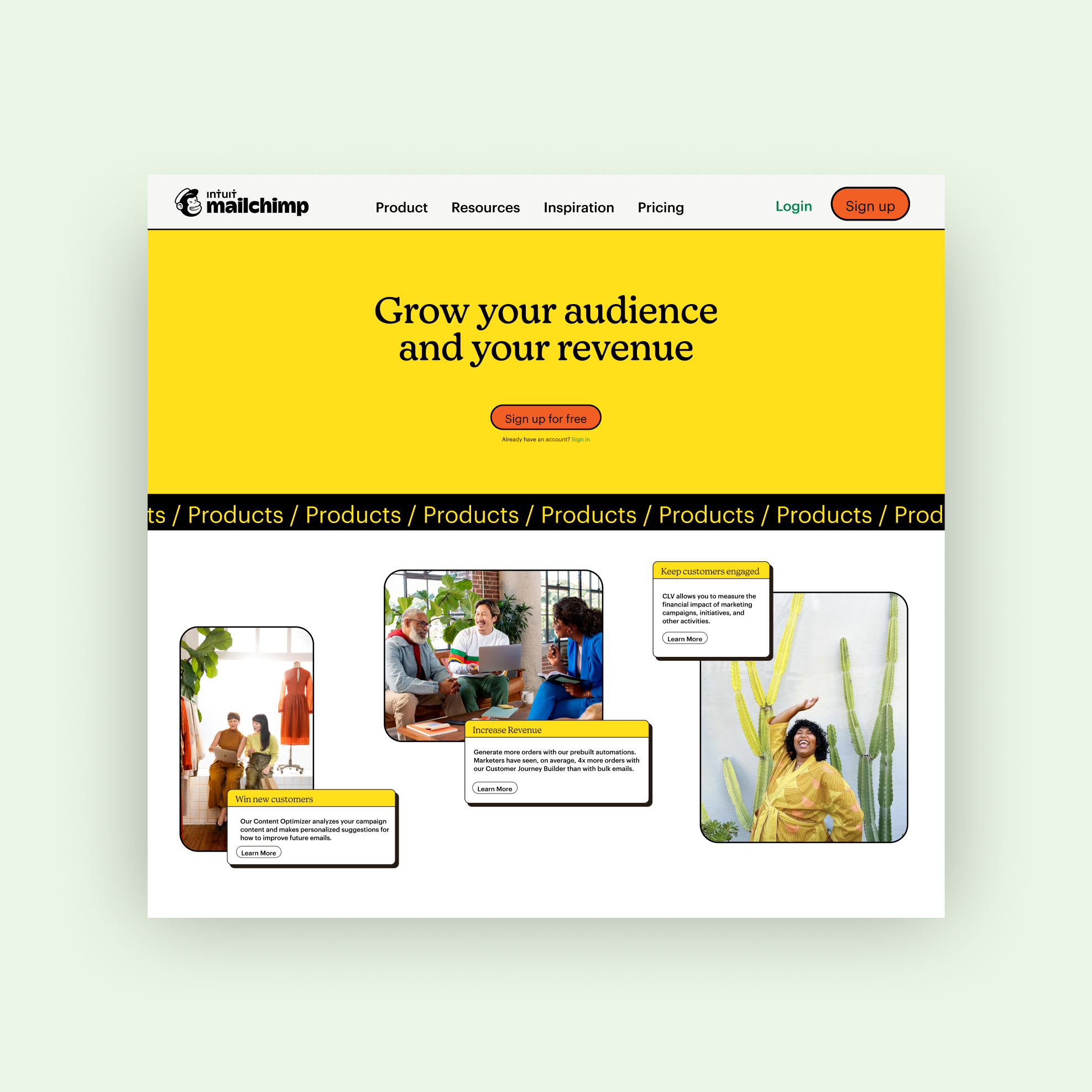
Homepage structure
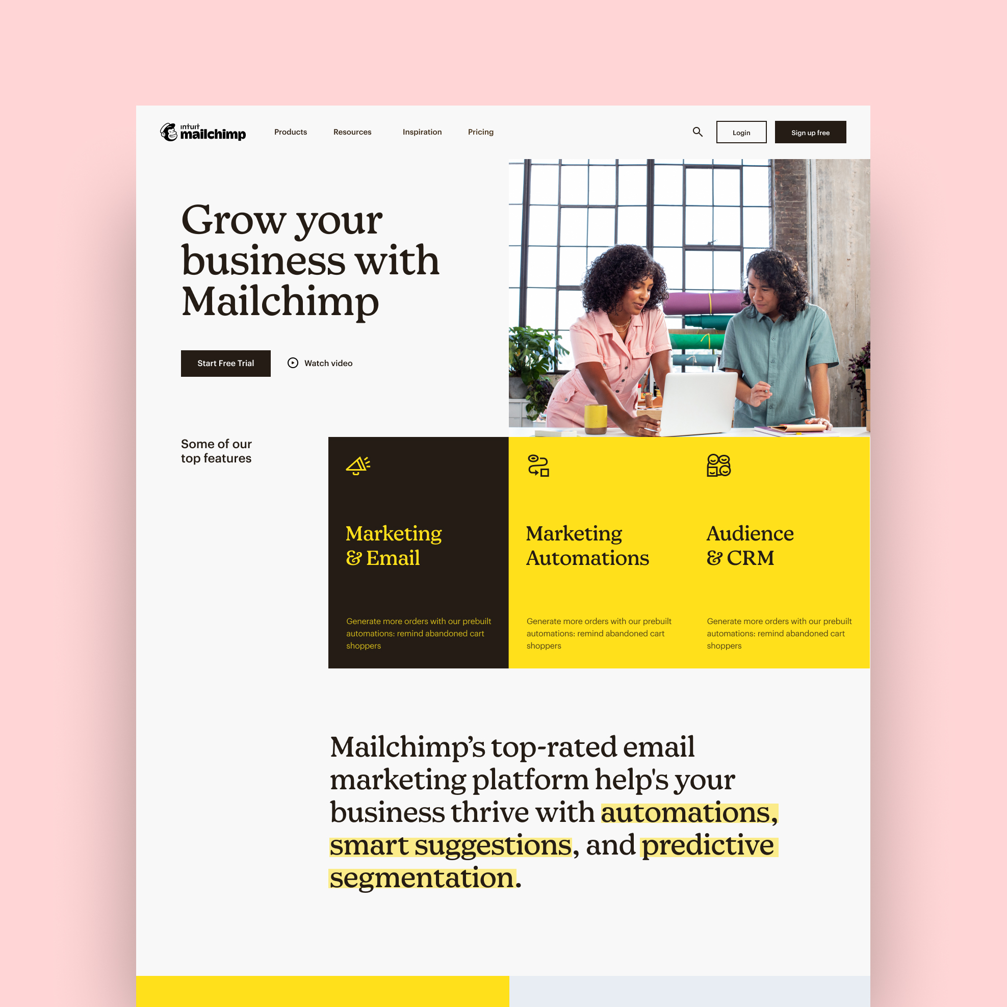
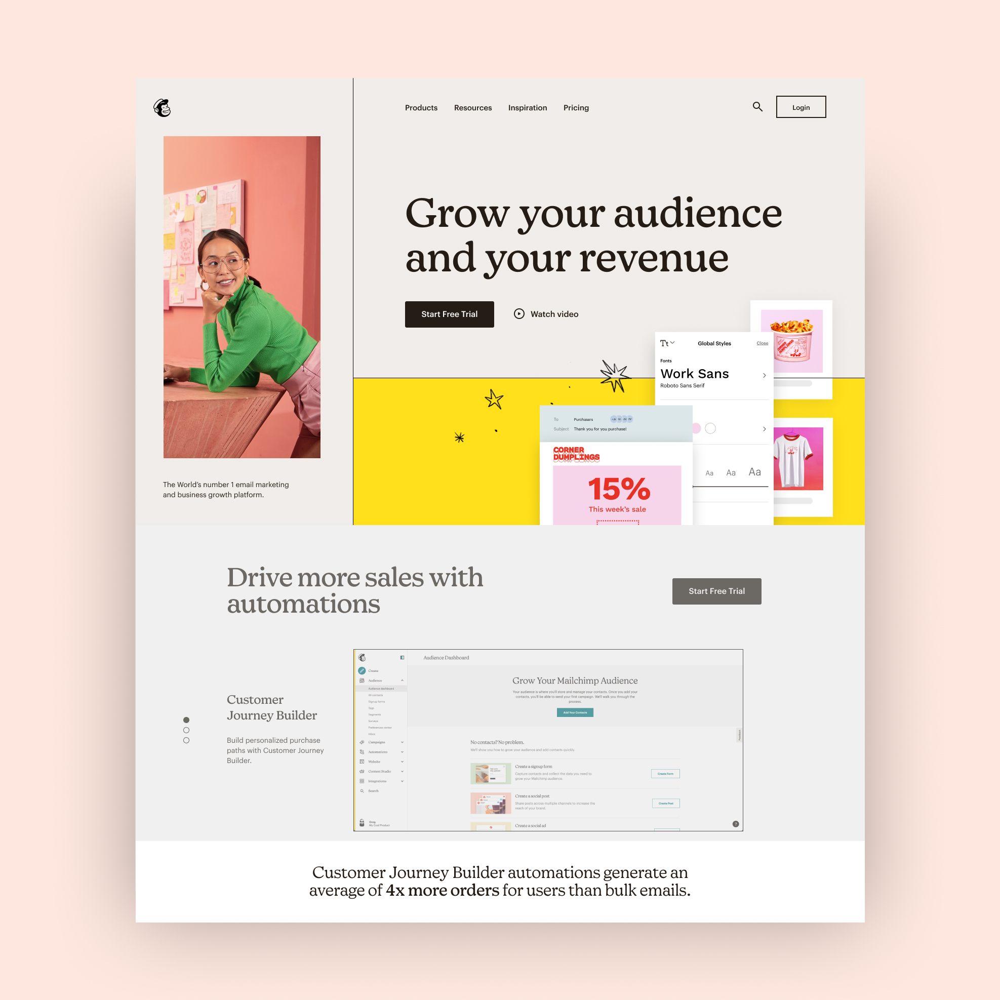
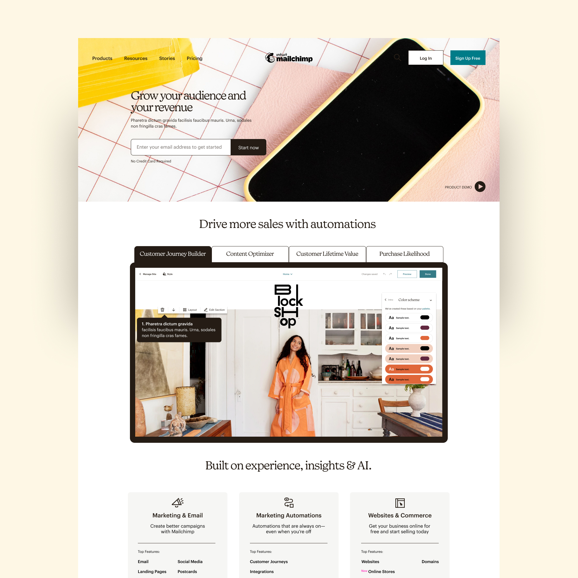
From 15,000+ pixels with no clear CTAs to 4,000 pixels (75% shorter) with conversion paths throughout.
Hero module
From unfocused messaging around ease of use, being a "do it all tool", and competing CTA buttons, to a consistent message of "increase revenue" with only one prominent CTA that always takes the user to the next step in the funnel.

Features section
From mentioning 30+ features, to only mentioning the four high-converting features (automated content generation, SMS, segmentation, and data-driven optimization). Scroll depth rose 20x past the old 2,000-pixel wall.

Call to action
From vague messaging and uncertainty about the next step, to a preview of the most popular plans, every CTA pointing to the pricing page.

Enterprise support
From self-help docs for everyone, to white-glove treatment that connects larger clients directly with customer support agents.

Trust signals
From a pile of testimonials and badges that didn't mean anything, to leaning on Mailchimp's market-leader recognition, and guiding users to the pricing page.

Navigation
From a complex structure with confusing, marketing-centric copy, to a streamlined nav with clear and descriptive copy that surfaces the features that prospects care about most.

Results
My team proved with data that adding more information to the homepage was the wrong approach. We used fewer but better modules, and the new visual language went on to influence the wider Mailchimp product.
- 45% increase of traffic from homepage to pricing page within 1 month.
- 4% increase of account activation within 1 month.
This case study demonstrates how challenging conventional wisdom (by following best practices) with strategic simplification can dramatically improve user engagement and conversion metrics.