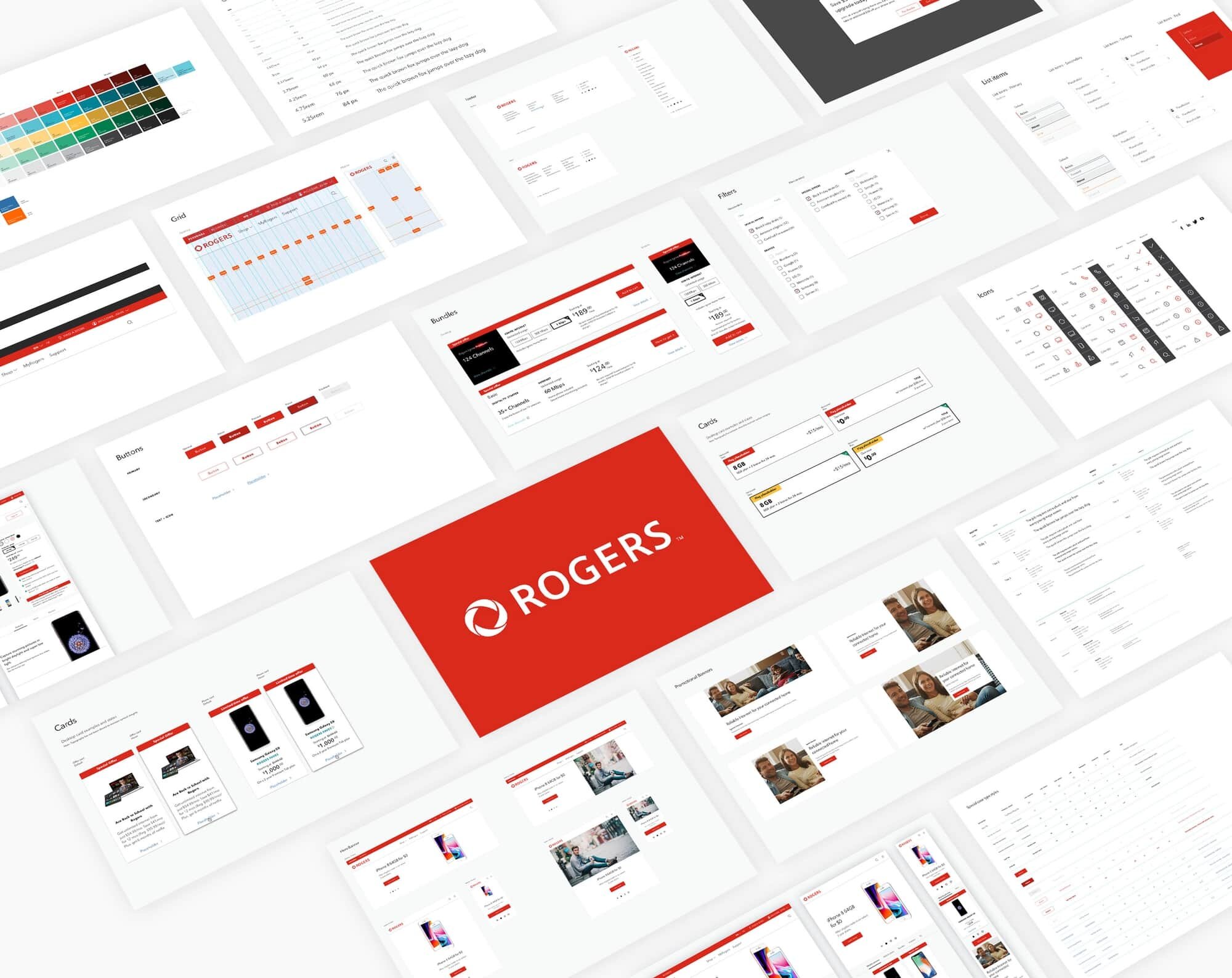
Rogers and Fido, two of Canada's biggest telecom brands, had no design system and were still designing in Photoshop. I built one shared design system for both, redesigned their highest-revenue page, and trained their team to run it without me. Both are still live with minor changes, six years later.
Rogers Communications, one of Canada's largest telecoms, was mid digital transformation. So was its subsidiary brand Fido, a separate consumer wireless brand under the same parent, worth over a billion dollars in revenue. Neither had a design system. Both internal teams were still designing in Photoshop, at a point when design systems were barely an established discipline.
The clearest symptom sat on their highest-revenue pages. Rogers priced phones differently depending on which plan a customer picked, and the page made it nearly impossible to compare. Fido's phone-buying page had the same structural problem. These were the two brands' main digital doors for acquiring customers, and the doors were hard to use.
The scale made it worse. In the first half of 2018 alone, rogers.com took 84 million visits and fido.ca another 44 million, over 70% of them on mobile. Both sites were still designed desktop-first.
My role
I was Lead UX Designer on the 17seconds team, responsible for producing the UX recommendations and assets across both brands. I worked with Greg Morantz (Head of UX Strategy and Design), Tim Carpenter (Creative Director), Li Li (visual designer), Bruce Randall (partner and strategist), and Ian Torrey (executive producer). The engagement, codenamed Project X internally, started with a kickoff workshop in Toronto in May 2018. We worked directly with Rogers' and Fido's stakeholders and internal teams in Canada. Because Rogers and Fido share one internal team behind two consumer-facing brands, I treated it as a single engagement: one team, two brand expressions to design for.
Who I designed for
Rogers skews mainstream and premium. Fido skews younger and more value-driven. Same parent company, same internal team, two different audiences with different expectations of tone and visual identity. The system had to hold a consistent foundation while still feeling like two distinct brands to the people buying phones.
How we worked
The engagement ran in design cycles, four customer journeys per brand at a time. Each cycle produced around 60 wireframe states, a dozen visual comps, and interactive prototypes, then went through Rogers UX signoff before the next cycle started. Over the year the journeys covered the account dashboard, billing, hardware upgrades, new activations, support, residential bundles, search, and the homepage and navigation.
Before designing anything, we benchmarked AT&T, Verizon, T-Mobile, and Bell, and mapped user flows for the scenarios that carry most of the traffic: paying a bill, checking usage, upgrading a phone, shopping for a plan, and shopping for home internet. Design decisions were argued from Rogers' own analytics and call center data, not taste. Even the grid (12 columns, six breakpoints from 320px up) was set by looking at what devices those 128 million visits actually came from.
One system, two brands
We built the system in Sketch App, with components linked to coded modules through InVision's Design System Manager, so developers had a direct bridge from design to code. I didn't work hands-on with Rogers' developers; the DSM documentation was the handoff mechanism itself.
The system shared its foundation, components, code, and logic, across both brands, with a customization layer on top for each one's visual identity and tone. One system, two brand expressions. I used the phone-buying redesigns as the real-world testbed: every component proved itself on a live page before it became part of the official system, so the system was tested before launch.
The phone-buying redesign
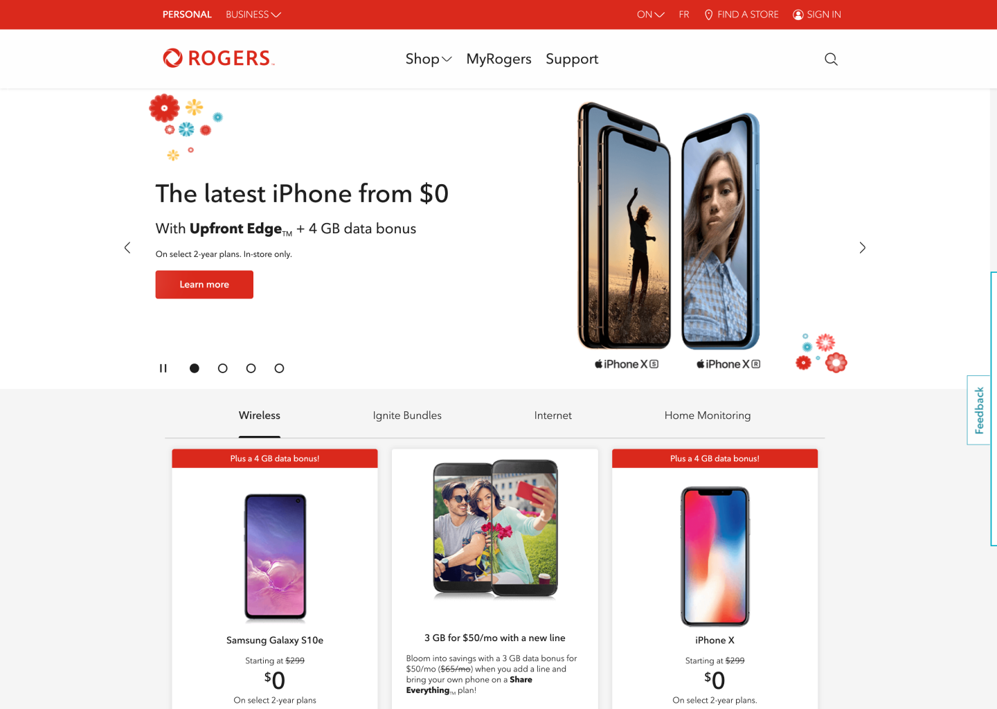
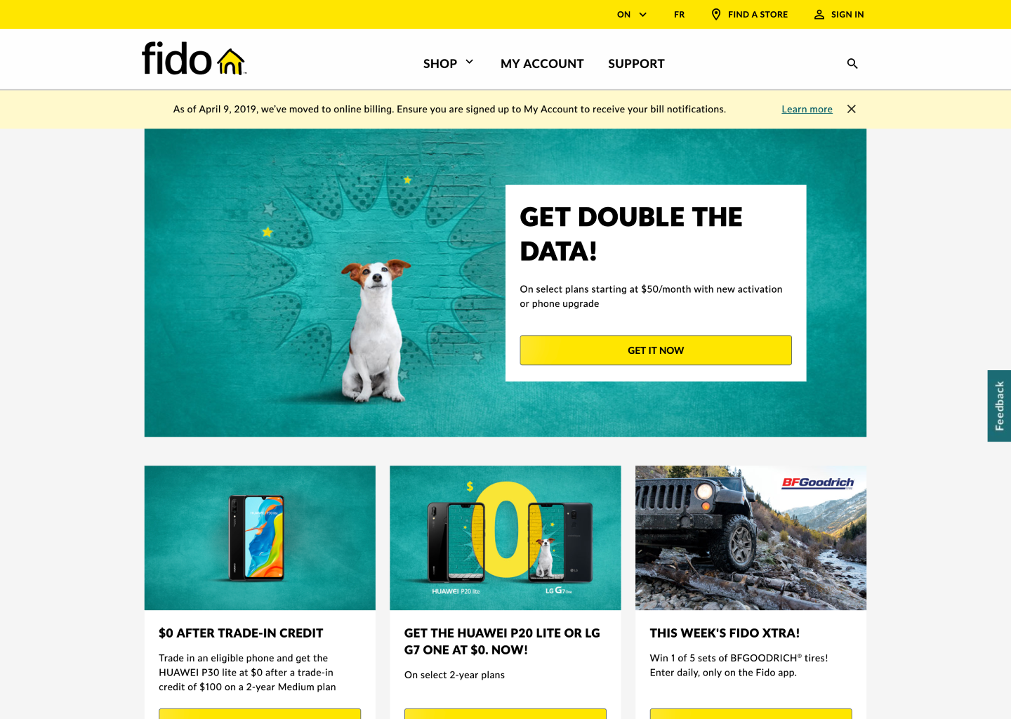
Both pages had the same root problem: customers couldn't see how a phone's price changed across plan options in one view. I redesigned the information architecture and pricing presentation for rogers.com/phones and Fido's equivalent page, applying the same structural fix adapted to each brand's tone.
The core change was letting customers choose how prices were displayed: lowest available, lowest due now, or closest to their current plan. An existing customer saw numbers that applied to them instead of a promotional price they could never get. Around that sat filtering by device type, brand, and promotion, explored through several layout rounds (top filters, left rail, tabs) before we landed on the shipped pattern.
Roger's phone buying experience after redesign
Fido's phone buying experience after redesign
Where static comps weren't enough, I built coded HTML prototypes of the phone page to test interactions like image galleries and spec tabs. The team also ran motion studies in After Effects for buttons, loaders, and transitions, so developers got specified behavior rather than a guess.
Working above the screens
The work reached past the website. In June 2018 we designed and ran a design thinking workshop for Rogers' executive leadership team, using customer data and personas to define service design principles the organization could act on: reactive to proactive, generic to personalized, transactional to relational. Rogers then extended the contract in October 2018 for a four-week customer journey transformation program: eight working sessions around the Ignite TV migration, mapping customer pain points across the full lifecycle with survey verbatims and call driver data. What started as a page redesign became consulting on how Rogers designs its customer experience.
Training the team to carry it forward
Part of the job was making sure the system outlived the engagement. I trained about seven people on the shared Rogers/Fido team directly, and recorded video walkthroughs so future hires could onboard without us in the room. I also led the team through switching their whole practice from Photoshop to Sketch. By the time we wrapped, the team had already adopted the system on their own.
Results
First design system for both Rogers and Fido, built and adopted by the shared internal team during the engagement.
Eight customer journeys redesigned across two brands in six design cycles, several hundred wireframe states and dozens of visual comps, each cycle signed off by Rogers.
Internal team moved off Photoshop and onto Sketch, modernizing how they work.
The engagement grew: Rogers extended the contract to have us bring the same methods to their executive team and their Ignite TV migration program.
Phone-buying pages for both brands shipped and are still live today, six-plus years later, at the highest-revenue digital touchpoint either brand owns.
One shared foundation serving two distinct brand expressions: an architecture pattern that's standard now, but was ahead of its time then.
The team left with the system, the tooling, and the training to keep going without us.
Curious about the full story?
Schedule a call and I'll walk you through my portfolio